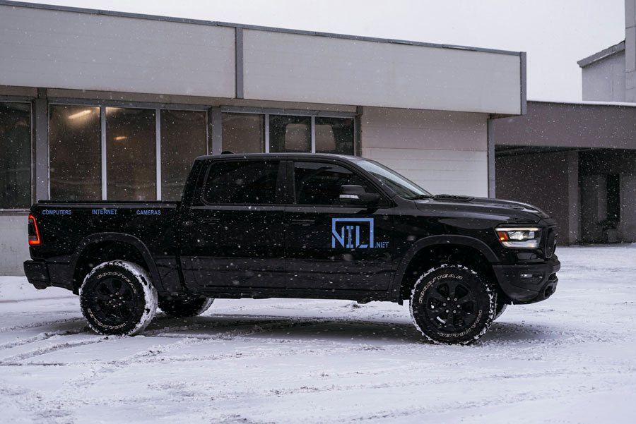
Logo Design/ Branding
Navigating the design of a tech company was a challenge. From going with an illustrated logo to a simple yet modern design.
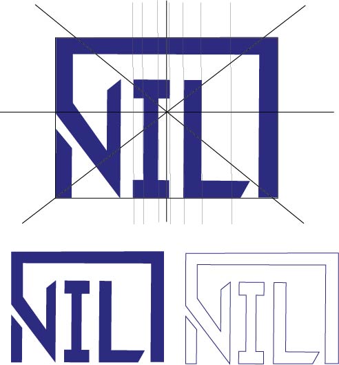
The NET part of the logo was an Arial Bold font a simple yet clean logo.
The rest of the logo was a Arial bold but modified with breaks for a more technical look. Which was what the final version of the logo came to. Lastly, the colour choice was blue ( gradient ) inspired by other tech companies.
*this is a fake company
